Friday, 20 November 2009

Thursday, 5 November 2009
Magazine
Front Cover:

For my magazine cover I tried to make the Magazine look professional yet youthful for the target audience of 16-19+ of college students.
I decided my magazine cover could have a theme, I used the “Go Green” theme which may interest some students, in order to grab the attention of other students I have added catchy cover lines which may appeal this age range instead of extremely important issues. I have added another Cover Line at the bottom of the cover which two topics that would interest students which are Jobs and Discounts. I have also made my magazine free with a free sign in the left third indeed of a bar code.
Contents:


For my magazine cover I tried to make the Magazine look professional yet youthful for the target audience of 16-19+ of college students.
I decided my magazine cover could have a theme, I used the “Go Green” theme which may interest some students, in order to grab the attention of other students I have added catchy cover lines which may appeal this age range instead of extremely important issues. I have added another Cover Line at the bottom of the cover which two topics that would interest students which are Jobs and Discounts. I have also made my magazine free with a free sign in the left third indeed of a bar code.
Contents:

Tuesday, 6 October 2009
10) CD Cover + Evaluation


For my CD Cover I went for a ‘Pop’ Genre. I used a side portrait of Ashleigh’s face which is almost fashionable/model like. I used a ‘Patch Tool’ to remove any mark from her face which makes the photo slightly surreal. The front Cover is serious where as the back really shows it’s a ‘Pop’ album, with the colourful lines behind the text and the colour top. The pose is also not as serious which shows there that shows the artist isn’t just a serious.
I used a classic font, “Century Gothic” to keep it simple yet easy to read.
Friday, 2 October 2009
10) Creating my CD Cover
Here is a Screen Shot of the original Image on the 12x12 CD Cover.
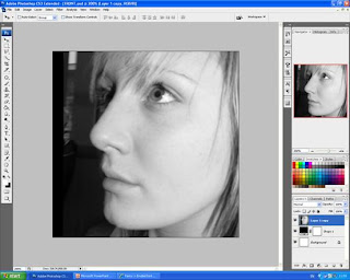
Here I have changed the images, making adjustments with the image, I have also used the Patch tool to take any blemishes or lines off her face.

Here is the complete image, which you can see is very different from the original image.

I have used the Polygonal Tool to cut around the image to make her fit into the black, I also changed the colour of her top to the image.

To make the titles stand out I have given each title its own colour box, I think it works well, I have since changed the position of the text.


Here I have changed the images, making adjustments with the image, I have also used the Patch tool to take any blemishes or lines off her face.

Here is the complete image, which you can see is very different from the original image.

I have used the Polygonal Tool to cut around the image to make her fit into the black, I also changed the colour of her top to the image.

To make the titles stand out I have given each title its own colour box, I think it works well, I have since changed the position of the text.

Monday, 21 September 2009
Subscribe to:
Posts (Atom)